

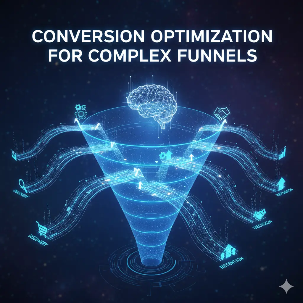
Most businesses obsess over driving more traffic while ignoring the fact that 70-95% of their visitors never convert.
The problem isn’t traffic volume. It’s the funnel.
A prospect visits your site from a Facebook ad about solving their specific problem. They land on a generic homepage. They can’t find the solution they clicked for. They see a “Request Demo” button when they just wanted to understand what you do. They leave.
Or worse: they make it to your signup flow, face a 12-field form asking for information they don’t have, abandon at step 3 of 5, and you never hear from them again.
Complex funnels—those with multiple stages, different stakeholders, long consideration periods, or high-ticket decisions—lose conversions at every step. Each additional click, form field, or decision point reduces conversion rates by 10-30%.
The math is brutal:
1,000 visitors → 100 sign up for free trial (10%) → 25 book demo (25%) → 8 become customers (32%)
Overall conversion: 0.8%
If you fix just one stage:
Improve trial signup to 15% → Overall conversion jumps to 1.2% (50% improvement)
If you fix two stages:
Trial to 15%, Demo booking to 35% → Overall conversion: 1.9% (138% improvement)
Same traffic. 2.4x more customers.
This isn’t about driving more visitors to a broken funnel. It’s about fixing the leaks so each visitor is worth more—dramatically improving ROI without increasing ad spend.
This guide provides the complete framework for optimizing complex, multi-stage funnels: identifying where prospects drop off, understanding why, fixing friction at each stage, aligning intent with experience, building trust through proof, personalizing based on behavior, testing systematically, and measuring properly.
Because the fastest path to growth isn’t always more traffic. Sometimes it’s converting more of the traffic you already have.
Why Complex Funnels Lose Conversions
Multi-Step Friction Points
Every additional step in your funnel creates an opportunity for prospects to leave.
The friction formula:
Overall conversion = Stage 1 conversion × Stage 2 conversion × Stage 3 conversion
Example:
- Stage 1 (landing → signup): 20%
- Stage 2 (signup → activation): 40%
- Stage 3 (activation → purchase): 30%
Overall: 0.20 × 0.40 × 0.30 = 2.4%
If Stage 2 drops to 30%:
Overall: 0.20 × 0.30 × 0.30 = 1.8% (25% decline)
One weak stage destroys the entire funnel.
Common friction points:
Unnecessary steps:
Five-step checkout when two would work. Each step loses 15-20% of users.
Form overload:
Asking for 15 fields when 5 essential ones would qualify the lead.
Example: B2B SaaS asking for company revenue, employee count, tech stack, budget, timeline, decision authority in initial form.
Result: 80% form abandonment. Those who complete are highly qualified but volume is too low.
Better: Ask name, email, company. Qualify later via conversation.
Unclear next steps:
“Thanks for signing up!” with no guidance on what to do next.
User doesn’t activate, never experiences value, churns.
Technical friction:
Slow page loads, broken mobile experiences, confusing navigation, error messages without clear resolution.
Payment friction:
Limited payment options, unclear pricing, surprise fees, complicated billing.
Each adds 10-30% drop-off.
The compounding effect:
3-step funnel, 10% friction per step:
100 visitors → 90 → 81 → 73 conversions (27% total loss)
5-step funnel, 10% friction per step:
100 visitors → 90 → 81 → 73 → 66 → 59 conversions (41% total loss)
More steps = exponentially more loss.
Measuring friction:
Track conversion rate between each step.
Example funnel analysis:
- Homepage → Product page: 35%
- Product page → Signup: 8% (bottleneck)
- Signup → Onboarding: 65%
- Onboarding → First value: 45%
- First value → Purchase: 28%
Product page → Signup is the leak. Fix this first.
The friction reduction strategy:
- Eliminate steps that don’t serve user or business goal
- Combine steps where possible (one page checkout vs. multi-page)
- Simplify remaining steps (fewer fields, clearer instructions)
- Add progress indicators (reduces anxiety about unknown process length)
Result: Each step improved by 5-10 percentage points = 50-100%+ overall conversion improvement.
Decision Fatigue in Long Journeys
The longer the journey, the more decisions required, the higher the cognitive load, the lower the completion rate.
Decision fatigue is real:
Every choice depletes mental energy. After 5-10 decisions, people default to “no” or abandon.
Example: SaaS signup flow
- Choose plan (3 options)
- Choose billing period (monthly vs annual)
- Enter company details (5 fields)
- Enter payment info (6 fields)
- Choose add-ons (4 optional features)
- Customize settings (8 preferences)
- Invite team members (optional)
- Watch tutorial or skip (choice)
8 decision points before experiencing product value.
Completion rate: 18%
Optimized flow:
- Email signup (1 field)
- Start using product immediately
- Upgrade prompt after experiencing value
Completion rate: 64%
3.5x improvement by reducing decision fatigue.
The paradox of choice:
More options feels better but reduces conversion.
Study: Jam tasting booth
- 24 jam varieties: 60% stopped, 3% purchased
- 6 jam varieties: 40% stopped, 30% purchased
10x higher purchase rate with fewer options.
Application to funnels:
Pricing pages:
- 5 plans + 3 add-ons + custom option = Analysis paralysis
- 3 clear plans with recommended option = 40% higher conversion
Feature lists:
- 47 features listed = Overwhelming
- 3 key benefits emphasized = Clear value prop, better conversion
Onboarding paths:
- “Choose your use case” with 8 options = Confusion
- Smart defaults + option to customize later = Smooth activation
Reducing decision fatigue:
Default selections:
Pre-select the most popular option. Users can change if needed, but most won’t.
Progressive disclosure:
Don’t ask everything upfront. Collect info as needed through journey.
Example: Netflix signup
Step 1: Email
Step 2: Password
Step 3: Plan (defaults to mid-tier)
Step 4: Payment
Simple, sequential, minimal decisions per step.
Recommendation engines:
Instead of “Choose from 200 options,” show “Based on [criteria], we recommend these 3.”
Clear “best choice” indicators:
“Most popular,” “Best value,” “Recommended for teams like yours”
Reduces decision burden, increases conversion 20-40%.
Time pressure:
Long consideration periods increase drop-off risk.
B2B example:
- Day 1: Download whitepaper
- Day 14: Receive nurture email
- Day 30: Book demo
- Day 60: Proposal sent
- Day 90: Decision made
90-day journey = countless opportunities to forget, deprioritize, or choose competitor.
Acceleration tactics:
- Reduce steps between stages
- Create urgency (limited time offers, seasonal triggers)
- Automate follow-up (don’t wait days between touchpoints)
Result: 30-50% faster progression through funnel = higher completion rates.
Misalignment Between Stages
Prospects at different funnel stages need different experiences. Mismatch = drop-off.
The awareness spectrum:
Unaware: Don’t know they have a problem
Problem-aware: Know problem, don’t know solutions exist
Solution-aware: Know solutions exist, evaluating options
Product-aware: Considering your specific product
Most aware: Ready to buy, comparing vendors
Each stage requires different messaging and offers.
Common misalignments:
Hard sell to early-stage prospects:
Problem-aware visitor lands on page → Sees “Buy Now” as only CTA → Leaves
They weren’t ready to buy, they wanted to learn.
Better: Offer educational content, comparison guide, or assessment tool
Educational content for late-stage prospects:
Product-aware visitor ready to buy → Lands on long-form educational blog post → Frustrated, goes to competitor with clearer purchase path
Better: Clear pricing, demo, or trial offer
Generic messaging across stages:
Every landing page says the same thing regardless of where visitor came from or what they searched for.
Example: Someone searching “best CRM for real estate” lands on generic CRM homepage talking about features across all industries.
They want to know if it works for real estate specifically. Generic message loses them.
Feature-focused for early stage:
Unaware visitor → Sees page listing 47 features → Doesn’t understand value → Leaves
Early stage needs outcome/benefit focus, not feature lists.
Lack of proof for late stage:
Solution-aware visitor comparing vendors → Your page has no case studies, testimonials, or pricing transparency → Can’t evaluate → Chooses competitor with better proof
Stage-specific conversion paths:
Early stage (awareness):
- Content offers: Guides, assessments, tools
- Low commitment: Email signup, not sales call
- Educational: “Learn how to solve X”
Mid stage (consideration):
- Comparison content: Your solution vs alternatives
- Social proof: Case studies, testimonials
- Medium commitment: Webinar, product tour
Late stage (decision):
- Clear CTA: Pricing, trial, demo, buy
- Proof heavy: ROI calculators, implementation details
- High commitment: Ready to start
The alignment fix:
Map content and CTAs to visitor intent:
If traffic comes from “what is [category]” search → Educational landing page → Content download CTA
If traffic comes from “[your brand] pricing” search → Pricing page → Trial or demo CTA
If traffic comes from comparison search → Comparison landing page → Demo CTA with competitive differentiation
Match the stage, improve conversion 2-5x.
Mapping the Full Conversion Journey
Awareness → Consideration → Decision
The three-stage framework:
Awareness stage:
Mindset: “I have a problem and need to understand it better”
Questions:
- What is this problem called?
- Am I the only one experiencing this?
- How serious is this?
- What causes it?
Content needs: Educational, problem-focused, empathetic
Conversion goal: Capture contact info, build trust
Consideration stage:
Mindset: “I understand my problem and I’m evaluating solutions”
Questions:
- What types of solutions exist?
- Which approach is right for my situation?
- What are others doing?
- What are the pros/cons of each option?
Content needs: Solution-focused, comparative, proof-heavy
Conversion goal: Position your solution as best fit, move to evaluation
Decision stage:
Mindset: “I’m ready to choose a vendor”
Questions:
- Which vendor should I choose?
- What’s the pricing?
- What does implementation look like?
- What if it doesn’t work?
Content needs: Vendor-specific, detailed, risk-reduction
Conversion goal: Remove final objections, close sale
Mapping your content to stages:
Audit existing content:
Awareness:
- Blog posts about problems
- Industry reports
- Educational videos
- Problem-solution guides
Consideration:
- Comparison pages
- Webinars
- Case studies
- ROI calculators
Decision:
- Pricing pages
- Product demos
- Free trials
- Implementation guides
- Customer testimonials
Gap analysis:
Do you have sufficient content at each stage?
Common gaps:
- Heavy on awareness (lots of blog content) but weak on decision (no clear pricing or trial path)
- Heavy on decision (product pages, pricing) but weak on awareness/consideration (no educational content to attract early-stage buyers)
The funnel flow:
Ideal journey:
Awareness content → Email capture → Nurture emails → Consideration content → Demo request → Decision content → Purchase
Each stage builds on previous, naturally progressing prospect toward conversion.
Tracking stage progression:
Tag contacts by stage:
- Awareness: Downloaded guide, read blog
- Consideration: Attended webinar, viewed case study
- Decision: Visited pricing, started trial
Monitor progression:
How many awareness leads move to consideration? How long does it take?
Bottleneck identification:
If 1,000 awareness leads but only 50 reach consideration → Consideration content gap or weak nurture
If 500 consideration leads but only 20 reach decision → Missing trust/proof or pricing concerns
Identifying Funnel Drop-Off Points
Where prospects leave tells you what’s broken.
The funnel visualization:
1,000 visitors
    ↓ 40% drop
600 view product page
    ↓ 85% drop (major leak)
90 start signup
    ↓ 35% drop
58 complete signup
    ↓ 60% drop (major leak)
23 activate feature
    ↓ 20% drop
18 become paying customers
Overall conversion: 1.8%
Biggest leaks:
- Product page → Signup (85% drop)
- Signup → Activation (60% drop)
Fix these two, conversion could reach 5-8%.
Measuring drop-off:
Google Analytics:
Set up funnel visualization showing each step and drop-off rate.
Example: E-commerce checkout funnel
- Cart: 1,000
- Shipping info: 650 (35% drop)
- Payment info: 520 (20% drop)
- Review order: 450 (13% drop)
- Purchase: 380 (16% drop)
Each step shows where friction exists.
Heatmaps & session recordings:
Hotjar, FullStory, etc. show:
- Where users click (are they finding the CTA?)
- How far they scroll (are they seeing key content?)
- Where they get stuck (form field confusion, error messages)
Example insight: 60% of users never scroll past hero section → Value prop buried too deep
Exit page analysis:
Which pages have highest exit rates?
If pricing page has 70% exit rate:
Possible issues:
- Price too high
- Unclear what’s included
- Missing comparison to competitors
- No proof of value
Time on page before exit:
<10 seconds: Didn’t match intent, wrong traffic source
10-30 seconds: Scanned but didn’t find what they needed
30-60 seconds: Engaged but encountered objection
2+ minutes: Seriously considered, hit specific blocker
Form abandonment analysis:
Which fields cause drop-off?
Asking for phone number → 40% abandon
Asking for company revenue → 50% abandon
Asking for credit card upfront → 65% abandon
Remove or delay these fields → Higher completion.
Device-specific drop-off:
Desktop: 25% drop-off at step X
Mobile: 65% drop-off at same step
Mobile-specific issue (form not optimized, button too small, page load too slow)
The drop-off diagnosis:
For each major leak:
- Quantify: What % drop off?
- Observe: What are users doing? (heatmaps, recordings)
- Ask: Why might they leave? (surveys, user testing)
- Hypothesize: Specific issue (friction, missing info, objection)
- Test: Fix and measure improvement
Tracking Micro-Conversions
Not every visitor converts immediately. Track smaller wins that lead to conversions.
Micro-conversions:
Actions indicating interest but not purchase.
Examples:
- Scroll depth (read 50%+ of page)
- Time on site (3+ minutes)
- Multiple page views (3+ pages)
- Video watch (watched 50%+ of demo video)
- Tool usage (used ROI calculator)
- Content download (got guide)
- Email open/click
- Return visit within 7 days
Why micro-conversions matter:
Leading indicators:
Users who complete micro-conversions are 3-10x more likely to eventually convert than those who don’t.
Example:
- Visitors who watch demo video: 25% eventual conversion
- Visitors who don’t: 3% eventual conversion
Optimization opportunities:
Can improve micro-conversions faster than macro-conversions (purchase).
If you increase video watch rate from 10% to 18%, you’ll see eventual conversion increase proportionally.
Funnel insights:
Shows which content/steps drive engagement even if not immediate conversion.
Setting up micro-conversion tracking:
Google Analytics Events:
- Scroll depth: Trigger at 25%, 50%, 75%, 100%
- Time on page: Trigger at 30 sec, 1 min, 2 min, 5 min
- Video: Play, 25%, 50%, 75%, complete
- Button clicks: Track all CTA clicks even if don’t convert
- Downloads: Track each content asset download
Engagement scoring:
Assign points to each micro-conversion:
- Page view: 1 point
- 50% scroll: 2 points
- Video watch: 5 points
- Content download: 10 points
- Pricing page view: 15 points
- Demo request: 50 points
Score > 30 = Hot lead
Retargeting based on micro-conversions:
Segment audiences:
- Watched video but didn’t convert → Retarget with case study
- Downloaded guide but didn’t book demo → Retarget with demo invitation
- Visited pricing 3x but didn’t start trial → Retarget with discount offer
More relevant retargeting = higher conversion.
Micro-conversion optimization:
Goal: Increase % who complete high-value micro-conversions
Tactics:
Increase video completion:
- Shorter videos (2 min vs 5 min)
- Engaging hooks in first 10 seconds
- Clear value prop upfront
Increase scroll depth:
- Compelling content above fold
- Visual breaks and scannable formatting
- Progressive disclosure (reveal more as they scroll)
Increase content downloads:
- More relevant lead magnets
- Clear value proposition
- Minimal form friction (email only vs 5 fields)
The micro-to-macro path:
Track correlation:
Users who complete X micro-conversion are Y times more likely to purchase.
Optimize the micro-conversions → More eventual macro-conversions.
Understanding Multi-Stakeholder Decision Making
Different Roles in the Buying Process
Complex purchases involve multiple people with different priorities.
Common stakeholder roles:
End User:
Cares about: Ease of use, features, daily workflow impact
Objections: “Is this too complicated?” “Will this make my job easier or harder?”
Needs: Product demos, user testimonials, training resources
Manager/Team Lead:
Cares about: Team adoption, productivity gains, reporting
Objections: “Will my team actually use this?” “How do I track results?”
Needs: Team management features, dashboards, case studies showing team results
Executive/Decision Maker:
Cares about: ROI, strategic fit, risk, total cost
Objections: “What’s the ROI?” “What if it doesn’t work?” “How does this compare to alternatives?”
Needs: ROI calculators, executive case studies, clear pricing, risk mitigation (trials, guarantees)
IT/Technical Buyer:
Cares about: Security, integration, technical requirements, implementation
Objections: “Does it integrate with our stack?” “Is it secure?” “How hard to implement?”
Needs: Technical documentation, security certifications, API docs, implementation guides
Procurement/Finance:
Cares about: Contract terms, pricing, vendor stability
Objections: “Can we get a better price?” “What are the payment terms?” “Is this vendor reliable long-term?”
Needs: Transparent pricing, flexible terms, company credentials
The buying committee:
Average B2B purchase involves 6-10 stakeholders.
Must address all their concerns or deal dies.
Example: HR software purchase
- HR manager (initiator)
- HRIS director (evaluates features)
- CFO (approves budget)
- IT director (evaluates technical fit)
- CEO (final sign-off)
Each has veto power. Content must address all five.
Content mapping by role:
Create role-specific content:
For end users:
- Feature tours
- “How to” guides
- User community
For managers:
- Team performance case studies
- Management dashboards
- Change management guides
For executives:
- ROI case studies
- Strategic whitepapers
- Executive briefings (concise, high-level)
For technical buyers:
- Integration guides
- Security documentation
- Technical architecture overviews
Role-based landing pages:
Homepage segments:
“Are you a marketing manager?” → Marketing manager page
“Are you a CMO?” → Executive page
“Are you in IT?” → Technical page
Each page speaks directly to that role’s priorities.
The multi-threaded sales approach:
Don’t rely on single champion to relay your message to other stakeholders.
Provide materials for each role:
Champion can forward executive one-pager to CFO, technical doc to IT, user guide to team.
OR: Invite all stakeholders to demo, tailoring presentation to address each role.
Messaging for Users vs Decision-Makers
Users and decision-makers care about different things. Generic messaging satisfies neither.
User messaging (feature/benefit focus):
User thinking: “Will this make my daily work easier?”
Messaging:
- “Save 5 hours per week on manual data entry”
- “Get alerts when deals are at risk”
- “Collaborate with your team in real-time”
Emphasis: Practical benefits, ease of use, time savings
Decision-maker messaging (business value focus):
Decision-maker thinking: “Will this deliver ROI and strategic value?”
Messaging:
- “Increase sales productivity 32% while reducing CAC”
- “Achieve payback in 4.2 months on average”
- “Reduce churn 28% through proactive engagement”
Emphasis: Business outcomes, financial impact, strategic advantages
The disconnect:
If you show user-focused messaging to executives:
They don’t care about daily workflow details. They want business case.
If you show executive messaging to users:
They don’t care about 32% productivity increase. They want to know if it’s easy to use.
Segmented landing pages:
User-focused landing page:
Headline: “Manage your pipeline in half the time”
Subhead: “Stop juggling spreadsheets. See all your deals, tasks, and contacts in one place.”
CTA: “Start free trial”
Executive-focused landing page:
Headline: “Increase revenue per rep 28% with predictable pipeline management”
Subhead: “Give your team the visibility and automation they need to close more deals faster. Achieve payback in 4 months.”
CTA: “See executive demo” or “Get ROI analysis”
Same product, different angles.
Dual-path nurture sequences:
User path:
Email 1: “5 ways [product] saves time”
Email 2: “Quick start guide”
Email 3: User case study
Email 4: “Tips for getting your team on board”
Executive path:
Email 1: “ROI case study: How [company] increased revenue 34%”
Email 2: “Comparing [category] solutions: Buyer’s guide”
Email 3: Executive testimonial
Email 4: “Total cost of ownership analysis”
Self-segmentation:
Let visitors choose their path.
Example website:
“I want to see the product” → User demo
“I want to see the business case” → Executive overview
Addressing Objections Across Stakeholders
Each stakeholder has unique objections. Address them all or lose the deal.
Common objections by role:
End user objections:
“Is it too complicated?”
Answer: Video showing simple 3-step workflow, “Set up in 5 minutes” messaging
“Will I have to change how I work?”
Answer: “Works with tools you already use” (integrations), minimal disruption messaging
“What if I need help?”
Answer: 24/7 support, robust help center, onboarding assistance
Manager objections:
“Will my team actually use it?”
Answer: Adoption case studies, team training resources, change management support
“How will I know it’s working?”
Answer: Dashboards showing team metrics, ROI reporting
Executive objections:
“What’s the ROI?”
Answer: ROI calculator, case studies with specific metrics
“What if it doesn’t work out?”
Answer: Free trial, money-back guarantee, low switching costs
“How does this compare to [competitor]?”
Answer: Comparison page, differentiation messaging
IT/Technical objections:
“Does it integrate with our existing systems?”
Answer: Integration marketplace, API documentation, pre-built connectors
“Is it secure and compliant?”
Answer: Security certifications (SOC 2, GDPR), security whitepaper
“How difficult is implementation?”
Answer: Implementation timeline, professional services availability
Procurement objections:
“Can we negotiate pricing?”
Answer: Flexible pricing tiers, volume discounts
“What are the contract terms?”
Answer: Standard terms published, month-to-month option
Objection-handling content:
FAQ section by role:
“FAQs for IT Teams”
“FAQs for Finance/Procurement”
“FAQs for End Users”
Each addresses role-specific concerns.
Proactive objection addressing:
Don’t wait for objections to be raised.
In sales materials and pages:
“Worried about implementation time? Our average customer is fully onboarded in 2 weeks with dedicated support.”
“Concerned about security? We’re SOC 2 Type II certified and GDPR compliant. [View security docs]”
“Not sure about ROI? Use our calculator to see projected impact for your team size.”
Reduces friction by preemptively answering concerns.
Building consensus:
Provide share-able resources:
One-pagers for each stakeholder role.
Example: “Share this executive summary with your CFO” or “Forward this technical brief to your IT team”
Makes it easy for champion to build internal support.
Aligning Traffic Intent with Funnel Stages
TOFU vs MOFU vs BOFU Landing Experiences
Top of Funnel (TOFU) – Awareness:
Intent: Learning, exploring, understanding problems
Landing page elements:
- Educational content
- Problem-focused headlines
- Low-commitment CTAs (download guide, subscribe, use tool)
- Minimal product pushing
Example:
Search: “how to reduce customer churn”
Landing page: “The Complete Guide to Reducing Churn: 12 Proven Strategies”
CTA: “Download free guide”
Middle of Funnel (MOFU) – Consideration:
Intent: Evaluating solutions, comparing options
Landing page elements:
- Solution-focused content
- Comparison information
- Social proof (case studies, testimonials)
- Medium-commitment CTAs (webinar, product tour, assessment)
Example:
Search: “best CRM for small business”
Landing page: “CRM Comparison: Which Solution Fits Your Team Size and Budget?”
CTA: “See product tour” or “Get personalized recommendation”
Bottom of Funnel (BOFU) – Decision:
Intent: Ready to buy, need final validation
Landing page elements:
- Product-specific information
- Pricing transparency
- Strong proof (customer logos, detailed case studies, ROI data)
- High-commitment CTAs (start trial, request demo, buy now)
Example:
Search: “[your brand] pricing”
Landing page: Pricing page with clear tiers, feature comparison, “Start free trial” CTA
The mismatch problem:
TOFU traffic → BOFU page = 90% bounce rate
Someone researching “what is marketing automation” lands on your pricing page.
They’re not ready to buy. Aggressive sales pitch scares them away.
BOFU traffic → TOFU page = Frustration
Someone searching “[your brand] demo” lands on educational blog post.
They’re ready to evaluate. Educational content wastes their time.
Intent-aligned experiences:
Match landing page to search intent:
Informational intent (“how to reduce churn”) → Educational landing page → Email opt-in
Commercial intent (“best CRM comparison”) → Comparison landing page → Demo or trial
Transactional intent (“[brand] pricing”) → Pricing page → Buy or trial
Dedicated landing pages:
Don’t send all traffic to homepage.
Create landing pages for each intent type:
- Problem-solving guides (TOFU)
- Solution comparisons (MOFU)
- Product pages with clear CTAs (BOFU)
Result: Conversion rates 3-5x higher than generic homepage.
Matching Content Depth to Buyer Awareness
The more aware the buyer, the less education needed.
Unaware buyers:
Need: Extensive education about the problem and solutions
Content depth: 2,000+ word guides, videos explaining fundamentals, step-by-step frameworks
Problem: If content is too shallow, doesn’t build enough trust or understanding
Solution-aware buyers:
Need: Solution comparison, differentiation, proof
Content depth: Comparison charts, case studies, feature breakdowns
Problem: If too much basic education, they get impatient
Product-aware buyers:
Need: Pricing, implementation details, risk mitigation
Content depth: Concise but specific: clear pricing, technical specs, onboarding process
Problem: If you bury pricing or make them work too hard to start, they choose competitor
The depth spectrum:
Early stage: 80% education, 20% product mention
Mid stage: 50% solution education, 50% product positioning
Late stage: 20% general context, 80% product-specific information
Content length by stage:
TOFU: Long-form (1,500-3,000 words) → Building comprehensive understanding
MOFU: Medium-form (800-1,500 words) → Comparison and evaluation
BOFU: Short-form (300-800 words) → Clear, specific, actionable
Progressive disclosure:
Start concise, offer depth for those who want it.
Example product page:
Above fold: 3 key benefits, clear CTA (200 words)
Below fold: Feature details (500 words)
Tabs: Technical specs, integrations, case studies (1,000+ words available but not required reading)
Users self-select depth based on awareness level.
Preventing Intent Mismatch
Intent mismatch kills conversion.
Common mismatches:
1. Keyword intent ≠ Landing page intent
Search: “free project management software”
Landing page: Paid plans with no free option
Result: Immediate bounce (they wanted free, you’re selling paid)
Fix: If targeting “free” keywords, offer genuine free tier
2. Ad promise ≠ Landing page delivery
Ad: “Get 50% off your first month”
Landing page: No mention of discount, generic product page
Result: Distrust, immediate exit
Fix: Match ad promise exactly on landing page (headline should echo ad copy)
3. Traffic source expectation ≠ Experience
LinkedIn audience: B2B professionals expecting professional content
Landing page: Consumer-focused, casual tone
Result: Credibility loss
Fix: Segment landing pages by traffic source, match tone and messaging
The intent diagnosis:
For each traffic source:
1. What is the user searching for or clicking on?
Example: Searching “how to create content calendar”
2. What do they expect to find?
A guide or template for creating content calendars
3. What do they actually find on your page?
Generic marketing automation product page
4. Is there a match?
No → Fix by creating dedicated “Content Calendar Guide” page with template download
Intent-matched conversion paths:
High-intent traffic (ready to buy):
Direct path to conversion: Pricing → Trial → Purchase
Low-intent traffic (researching):
Nurture path: Guide download → Email series → Webinar invite → Demo → Purchase
Don’t force low-intent traffic through high-intent funnel or vice versa.
Designing High-Converting Landing Pages for Each Stage
Education-Driven Pages for Early Stages
Purpose: Build trust, demonstrate expertise, capture contact info
Structure:
Headline: Problem-focused, empathetic
“Struggling to keep your sales team aligned on deals?”
Subheadline: Promise of solution without product pushing
“Learn the 5-step framework top sales teams use to improve pipeline visibility and close rates”
Body content:
- Explain the problem in detail (they feel understood)
- Outline solution approach (framework, methodology)
- Provide actionable insights (valuable even without product)
Minimal product mention: Brief “how we help” section at bottom, not main focus
CTA: Low-commitment
“Download the free guide” or “Watch the 5-minute overview”
Example:
Company: Sales CRM
TOFU page: “The Ultimate Guide to Sales Pipeline Management”
Content: 12-chapter guide on pipeline best practices
Product mention: Final chapter on “Tools that help” with brief CRM mention
CTA: Email to download guide
Conversion rate: 22% (high for TOFU)
Proof-Driven Pages for Mid-Funnel
Purpose: Position your solution as the best choice, build confidence
Structure:
Headline: Solution or outcome-focused
“How [Industry] Companies Are Reducing Churn by 28% with [Approach]”
Subheadline: Specific proof point
“See how 200+ companies like [Company A] and [Company B] are retaining customers longer with [solution type]”
Body content:
- Problem recap (brief, they already understand it)
- Solution overview (your approach)
- Heavy on proof: Case studies, customer quotes, before/after metrics
- Social proof: Customer logos, awards, third-party validation
Product positioning: More prominent but still benefit-focused, not feature-dump
CTA: Medium-commitment
“Watch customer story” or “See how it works” or “Get personalized demo”
Example:
Company: Marketing automation
MOFU page: “How E-commerce Brands Increased Revenue 34% with Marketing Automation”
Content:
- 3 detailed case studies
- Customer testimonials with specific metrics
- Comparison of automated vs manual approaches
CTA: “See [product] in action – Book demo”
Conversion rate: 12% to demo booking
Conversion-Focused Pages for Bottom Funnel
Purpose: Remove final objections, drive conversion
Structure:
Headline: Direct, action-oriented
“Start Your Free 14-Day Trial” or “See Pricing & Plans”
Subheadline: Risk mitigation
“No credit card required. Full access. Cancel anytime.”
Body content:
- Clear product information (what you get)
- Pricing transparency (no surprises)
- Trust signals (customer count, security badges, guarantees)
- FAQ addressing common objections
- Urgency/scarcity if appropriate (“Join 10,000+ companies”)
Heavy social proof:
- Customer logos
- Review ratings
- Specific testimonials about outcomes
CTA: High-commitment but frictionless
“Start free trial” or “Buy now” with simple form (email + password only)
Example:
Company: SaaS tool
BOFU page: Pricing page
Content:
- 3 clear pricing tiers
- “Most popular” badge on mid-tier
- Feature comparison chart
- “What happens after you sign up” timeline
- 30-day money-back guarantee
- Customer logos and “4.8 stars from 1,200+ reviews”
CTA: “Start free trial” (email + password, 2 fields)
Conversion rate: 18% to trial start
Reducing Friction Across Funnel Steps
Form Optimization
Forms are conversion killers. Every field reduces completion by 5-10%.
The field reduction principle:
10-field form: 40% completion
5-field form: 65% completion
3-field form: 80% completion
Each field removed = 5-10% improvement
Essential fields only:
Ask: “What’s the minimum information needed to achieve the goal?”
Example: Lead gen form
Unnecessary version: Name, email, phone, company, title, company size, industry, budget, timeline, how you heard about us (10 fields)
Completion: 28%
Optimized version: Name, email, company (3 fields)
Completion: 72%
157% improvement. Qualify later via conversation.
Progressive profiling:
Don’t ask everything at once.
First interaction: Email only
Second interaction: Name and company
Third interaction: Role and team size
Spreads friction across multiple touchpoints, each with higher completion.
Smart defaults:
Pre-fill when possible:
If email is john@acme.com, pre-fill “Company: Acme”
Use device/location data:
Pre-fill country, timezone based on IP
Reduces typing, increases completion 8-15%
Field design matters:
Single column > multi-column (15% higher completion)
Logical grouping (related fields together)
Clear labels (“Email address” not just “Email”)
Inline validation (show errors immediately, not after submit)
Progress indicators (Step 1 of 3 reduces anxiety)
Mobile optimization:
Large tap targets (buttons 44×44px minimum)
Appropriate input types (number keyboard for phone, email keyboard for email)
Autofocus on first field
One-question-per-screen on mobile (less overwhelming than 8 fields at once)
Result: 30-50% mobile completion improvement
Simplifying Onboarding or Booking Flows
Every step is a chance to lose the user.
The onboarding goal: Get user to “aha moment” as fast as possible
Bad onboarding:
- Create account (email, password, name, company, title)
- Confirm email
- Choose plan
- Enter payment info
- Customize 8 settings
- Invite team members
- Watch 15-minute tutorial
- Finally allowed to use product
Completion rate: 12%
Good onboarding:
- Email signup (1 field)
- Immediately in product with smart defaults
- Contextual prompts guide to first value
- Upgrade prompt after experiencing value
Completion rate: 68%
The quick-win strategy:
Get users to value BEFORE asking for commitment
Example: Design tool
Bad: Signup form → Payment → Empty canvas → “Now what?”
Good: Use tool with demo content → See value → “Save your work” → Email signup → Continue working → Upgrade later
They experience value before friction.
Reducing booking friction:
Bad booking flow:
- Choose service type (5 options)
- Choose date from calendar
- Choose time slot
- Enter name, email, phone, company, reason for call
- Confirm
Completion: 22%
Good booking flow:
- Click “Book demo”
- Choose time slot (with AI pre-selection of best times)
- Email only
- Done. Confirmation sent with calendar invite.
Completion: 64%
Additional info collected via confirmation email or pre-call questionnaire.
Removing Unnecessary Decision Points
Every decision is an opportunity to abandon.
The decision audit:
List every decision your funnel requires:
- Choose plan (3 options)
- Monthly vs annual
- Add-ons (4 optional features)
- Payment method
- Enter billing info
- Agree to terms
- Confirm email
- Choose onboarding path (3 options)
8 decisions before using product
Eliminate or automate:
Default selections: Pre-select most popular plan, annual billing (with option to change)
Delay decisions: Don’t ask about add-ons until they’ve used core product
Remove choice: “Start with our Starter plan, upgrade anytime” (no plan selection needed)
Revised: 3 decisions (email, password, confirm)
The paradox of choice:
More options = lower conversion
Study: Retirement plan enrollment
- 2 investment options: 75% enrollment
- 10 options: 61% enrollment
- 59 options: 42% enrollment
Too many choices = paralysis
Application:
Pricing pages:
Instead of 5 plans + custom option, show 3 clear tiers with “Recommended for teams like yours”
Feature toggles:
Instead of 12 optional features at signup, smart defaults with “Customize later”
Shipping options:
Instead of 6 shipping methods, show 2: “Standard (5-7 days, free)” and “Express (2-3 days, $15)”
The recommendation engine:
When choice is necessary, guide it:
“Based on your team size (15 people), we recommend the Pro plan”
“Most customers in [industry] choose [option]”
Reduces decision burden, increases conversion 25-40%
Trust & Proof as Conversion Drivers
Case Studies and Social Proof
Prospects don’t trust your claims. They trust other customers’ experiences.
Case study essentials:
Structure:
- Customer intro: Company, industry, size (relatable context)
- Challenge: Specific problem they faced
- Solution: How your product solved it
- Results: Quantified outcomes (metrics, not adjectives)
Example:
“Acme Corp, a 50-person SaaS company, was struggling to keep their sales team aligned on deals. Pipeline visibility was poor and deals were falling through cracks.
After implementing [Product], they:
- Increased close rate from 18% to 28%
- Reduced sales cycle from 45 to 32 days
- Grew revenue 34% in 6 months
‘The difference was night and day. Finally our team is on the same page.’ – Sarah M., VP Sales”
Specific, credible, persuasive.
Case study placement:
MOFU pages: Comparison pages, solution pages
BOFU pages: Pricing page, product pages
Email nurture: Day 5 of consideration sequence
Industry-specific case studies:
Segment by industry:
“See how [Product] works for SaaS companies” → SaaS case studies
“See how [Product] works for E-commerce” → E-commerce case studies
Relevance increases conversion 40-60%
Social proof types:
Customer count: “Join 10,000+ companies using [Product]”
Customer logos: Display recognized brands (builds credibility by association)
Reviews/ratings: “4.8 stars from 1,200+ reviews” with link to review site
User-generated content: Customer photos, videos, testimonials
Media mentions: “As featured in Forbes, TechCrunch, WSJ”
Awards: “G2 Leader 2024” or “Best in Category”
Each type of proof reduces risk perception and increases conversion.
Testimonials and Client Logos
Testimonials:
Weak testimonial:
“Great product! Easy to use.”
- John D.
Generic, no context, not persuasive.
Strong testimonial:
“We went from manually tracking 200 leads in spreadsheets to managing 2,000 opportunities with complete visibility. Our close rate increased from 22% to 31% in 90 days.”
- Sarah Martinez, VP Sales, Acme Corp (SaaS, 50 employees)
Specific outcome, credible source, relatable context.
Testimonial best practices:
Include full name and title: Credibility (not just “John D.”)
Include company and context: Relatability (company size, industry)
Specific outcomes over generic praise: “Increased close rate 31%” > “Great product”
Photo if possible: Humanizes, increases trust
Video testimonials: 10x more impactful than text (if feasible)
Placement:
- Homepage (above fold)
- Pricing page (near CTA)
- Product pages (relevant to feature)
- Case study pages
- Checkout page (final trust signal)
Client logos:
Why logos work:
Social proof by association: “If Microsoft trusts them, they must be good”
Category validation: Multiple recognizable logos = established player
Logo guidelines:
Use well-known brands: 5 recognizable logos > 50 unknown logos
Relevant industries: If targeting healthcare, show healthcare clients
Keep current: Update regularly, remove churned customers
Don’t fabricate: Only include actual customers (legal and ethical requirement)
Placement:
- Homepage (social proof section)
- Pricing page (near plans)
- About page
- Case studies page
“Trusted by” sections:
“Trusted by 10,000+ companies including:” [Logos]
Adds context to logos, increases impact.
Data-Backed Credibility Signals
Numbers > adjectives
Weak: “Our customers see great results”
Strong: “Our customers see an average 28% increase in close rates within 90 days”
Credibility signals:
Customer metrics:
- “Trusted by 10,000+ companies”
- “Processing 2M+ transactions daily”
- “5M+ users worldwide”
Performance data:
- “Average ROI: 320% in first year”
- “Typical payback period: 4.2 months”
- “Customers report 28% productivity increase”
Reliability metrics:
- “99.99% uptime SLA”
- “24/7 support with <2 hour response time”
- “SOC 2 Type II certified”
Experience indicators:
- “Founded in 2010, serving customers for 14+ years”
- “Processed $2B+ in transactions”
- “Deployed in 40+ countries”
Third-party validation:
Security certifications:
SOC 2, GDPR compliance, ISO 27001, HIPAA (if applicable)
Awards:
G2 Leader, Capterra Best Value, Inc. 5000
Partnerships:
Official partners with Salesforce, HubSpot, etc.
Media coverage:
As featured in [reputable publications]
The data presentation:
Use specific numbers:
“10,000+ customers” > “Thousands of customers”
“28% increase” > “Significant increase”
“4.2 months” > “Fast payback”
Source when possible:
“Based on analysis of 500 customers over 12 months” (adds credibility)
Visualize:
Charts, graphs, comparison tables make data more digestible and credible
Update regularly:
Stale data (“Trusted by 5,000 customers” when you now have 12,000) hurts credibility
Personalization & Behavioral Targeting
Dynamic Messaging Based on Visitor Behavior
Show different content based on what visitors do.
Behavioral triggers:
Pages visited:
Visited pricing 3x → Show “Ready to get started?” popup with trial CTA
Visited case studies → Show industry-specific case study on next visit
Time on site:
Spent 3+ minutes reading product page → High interest, show demo offer
Spent <30 seconds → Low interest, show educational content offer
Scroll depth:
Scrolled 75%+ on guide → Engaged, show related content or next step
Didn’t scroll past hero → Not engaged, A/B test hero section
Return visits:
First visit → Educational messaging
Second visit → “Welcome back! Pick up where you left off”
Third visit → “Ready to start your trial?”
Example implementations:
E-commerce:
Browsed product category multiple times:
Show: “Still interested in [category]? Here’s 15% off”
Added to cart but didn’t purchase:
Show: Abandoned cart email + retargeting ad with discount
Purchased previously:
Show: “Customers who bought [previous item] also loved [recommendation]”
SaaS:
Started trial but didn’t activate:
Show: Onboarding tips popup, helpful video, “Need help getting started?”
Used feature A heavily:
Show: “You’re using [Feature A] a lot. Did you know [Feature B] works great with it?”
Approaching trial end:
Show: “3 days left in trial. Upgrade now and save 20%”
Dynamic content blocks:
Personalized headlines:
Default: “The Best CRM for Growing Teams”
Returning visitor from healthcare industry: “The Healthcare CRM Trusted by 200+ Practices”
Personalized CTAs:
First-time visitor: “Learn More”
Return visitor: “Start Your Free Trial”
High-intent visitor (pricing page): “Get Started Now”
Personalized testimonials:
Show testimonials from similar company size/industry
Visitor from education: Show education customer testimonials
Visitor from e-commerce: Show e-commerce testimonials
Segmentation by Intent or Source
Different traffic sources = different intent = different experiences
Source-based segmentation:
Google search (high intent):
- Direct path to conversion
- Product-focused landing pages
- Clear CTAs (trial, demo, purchase)
Facebook ad (lower intent):
- Educational content first
- Social proof heavy
- Softer CTAs (guide download, webinar)
Email click (engaged audience):
- Continuation of email message
- Personalized based on email segment
- Relevant next step based on funnel stage
Industry publication referral:
- Industry-specific messaging
- Case studies from that industry
- Authority positioning
Intent signals:
High intent:
- Searched “[brand] pricing”
- Clicked “request demo” in email
- Visited site 5+ times
- Viewed pricing page
Experience: Direct conversion path, minimal friction
Medium intent:
- Searched “best [category]”
- Clicked blog link
- First or second visit
- Viewed product page
Experience: Proof and comparison focused, demo or trial CTA
Low intent:
- Searched “how to [problem]”
- Clicked social post
- First visit
- Only viewed blog
Experience: Educational, content offer, low-commitment CTA
Segment-specific landing pages:
Traffic from Facebook ad about productivity:
Headline: “10 Ways to Boost Team Productivity”
Content: Productivity tips (ad promise delivered)
CTA: “Download the full guide”
Traffic from Google search “project management software”:
Headline: “Complete Project Management for Growing Teams”
Content: Product features, pricing preview
CTA: “Start free trial”
Same product, different approach based on source and intent.
Adaptive Funnel Experiences
Funnel adapts based on user behavior and attributes.
Adaptive qualification:
User selects “company size: 1-10 employees”:
→ Shown Starter plan as recommended
→ SMB-focused case studies
→ Self-service signup flow
User selects “company size: 100+ employees”:
→ Shown Enterprise plan
→ Enterprise case studies
→ “Talk to sales” CTA (complex sale)
Same funnel, different path based on qualification.
Progressive complexity:
New user:
Simple interface, minimal options, guided onboarding
Power user (high activity, advanced features used):
Advanced interface, more controls, shortcuts, API access
Adapts as user sophistication increases.
Behavioral funnels:
User A journey:
Home → Blog → Email signup → Nurture (5 emails) → Webinar → Demo → Purchase
18 days, educational focus
User B journey:
Google search → Pricing → Trial signup → Activation → Upgrade → Purchase
3 days, self-serve focus
Different users, different optimal paths. Let them choose.
Smart routing:
Based on form responses:
“What’s your primary use case?”
- “Marketing automation” → Marketing-focused demo
- “Sales pipeline” → Sales-focused demo
- “Customer success” → CS-focused demo
Relevant demo experience increases conversion 40-60%
Exit-intent personalization:
First-time visitor about to leave:
Show: “Before you go, download our free guide”
Return visitor who viewed pricing:
Show: “Get 20% off if you start your trial today”
Already trialed but didn’t convert:
Show: “Come back and get an extended 30-day trial”
Retargeting & Multi-Touch Conversion Paths
Retargeting for Incomplete Conversions
Most visitors don’t convert on first visit. Bring them back.
Retargeting audiences:
Website visitors (no conversion):
Visited site, didn’t convert → Generic retargeting
Specific page visitors:
- Visited pricing but didn’t start trial → “Start your free trial” ad
- Viewed specific product → Ad highlighting that product
- Read blog posts → Educational content or webinar invite
Cart abandoners (e-commerce):
Added to cart, didn’t purchase → “You left items in your cart” + discount offer
Trial starters who didn’t activate:
Started trial, didn’t use product → “Need help getting started?” + tutorial
Churned customers:
Previously paid, no longer customer → Win-back offer
Retargeting ad strategy:
Match ad to intent level:
Low intent (visited blog):
Ad: “The Complete Guide to [Topic]” → Content download
Medium intent (viewed product page):
Ad: “See how [Product] helps companies like yours” → Demo or case study
High intent (viewed pricing, started trial):
Ad: “Start your free trial” or “Get 20% off” → Direct conversion
Sequential retargeting:
Don’t show same ad repeatedly.
Day 1-3: Brand awareness ad (remind them who you are)
Day 4-7: Value proposition ad (why choose us)
Day 8-14: Social proof ad (customer testimonials)
Day 15-21: Offer ad (trial, demo, discount)
Day 22-30: Last chance / urgency ad
Progressive messaging builds case over time.
Frequency capping:
Don’t burn out audience.
Limit: 3-5 impressions per person per week
Too many = ad fatigue and brand damage
Exclusion lists:
Don’t retarget people who already converted.
Exclude:
- Current customers
- Active trial users
- Recent purchasers
Focus budget on prospects, not existing customers.
Email and Remarketing Nurture Sequences
Not everyone is ready to buy today. Nurture over time.
Abandoned cart sequence (e-commerce):
Email 1 (1 hour after abandonment):
Subject: “You left something behind”
Content: Cart reminder, product images, “Complete your purchase” CTA
Email 2 (24 hours):
Subject: “Still interested? Here’s 10% off”
Content: Incentive to complete purchase, urgency (limited time)
Email 3 (3 days):
Subject: “Last chance: Your cart expires soon”
Content: Final urgency, social proof, guarantee
Conversion rate: 15-30% of abandoned carts recovered
Trial nurture sequence (SaaS):
Email 1 (Day 1 – welcome):
Subject: “Welcome to [Product]! Here’s how to get started”
Content: Quick start guide, first steps, support resources
Email 2 (Day 3 – activation):
Subject: “Get the most out of [Product] in 3 steps”
Content: Key features, tutorial videos, activation tips
Email 3 (Day 7 – engagement):
Subject: “See how [Company] increased productivity 28% with [Product]”
Content: Customer case study, specific outcomes
Email 4 (Day 11 – upgrade prompt):
Subject: “Upgrade to unlock [Advanced Features]”
Content: Premium features, ROI benefits, upgrade offer
Email 5 (Day 13 – expiring trial):
Subject: “Your trial expires in 2 days – Upgrade and save 20%”
Content: Urgency, discount offer, what they’ll lose if they don’t upgrade
Lead nurture sequence (B2B):
Email 1 (Day 1):
Subject: “Thanks for downloading [Guide]”
Content: Deliver content, related resources
Email 2 (Day 3):
Subject: “Implementing [Strategy from Guide]? Here’s how”
Content: Implementation tips, case study
Email 3 (Day 7):
Subject: “See [Product] in action: Join our webinar”
Content: Webinar invitation, social proof
Email 4 (Day 14):
Subject: “How [Customer] achieved [Result] with [Product]”
Content: Detailed case study, ROI data
Email 5 (Day 21):
Subject: “Ready for a personalized demo?”
Content: Demo offer, calendar link, no-obligation pitch
Conversion rate: 8-15% of nurture leads book demo
Behavioral triggers:
Send emails based on actions, not just time:
Trigger: Clicked pricing link in email
Action: Send email about free trial with testimonials
Trigger: Watched demo video
Action: Send email offering personalized demo
Trigger: Visited site 3x in one week
Action: Send email with special offer or “ready to talk?” CTA
Re-engagement sequences:
For inactive leads/trial users:
Email 1: “We miss you! Here’s what you’re missing”
Email 2: “New features you should check out”
Email 3: “Come back and get [incentive]”
Win-back rate: 5-12% of dormant users
Experimentation & Funnel Testing
A/B Testing Across Funnel Stages
Don’t guess. Test.
What to test by funnel stage:
TOFU (awareness pages):
- Headlines (problem vs solution focused)
- Content format (long-form vs video vs infographic)
- CTA copy (“Download guide” vs “Get the free guide”)
- CTA placement (above fold vs end of content)
- Form fields (email only vs email + name)
MOFU (consideration pages):
- Proof elements (case study placement, testimonial format)
- Comparison tables (feature emphasis)
- Demo video (length, content focus)
- CTA urgency (“Book demo” vs “Book demo – spots limited”)
BOFU (decision pages):
- Pricing display (monthly vs annual emphasized)
- Plan positioning (“Most popular” badge)
- Guarantee strength (30-day vs 60-day money-back)
- CTA friction (email only vs email + payment)
- Trust signals (placement, type)
Test one variable at a time:
Bad test: Change headline, CTA copy, and images simultaneously
If conversion improves, which change caused it? Unknown.
Good test: Change only headline
Control: “Increase Sales Productivity”
Variant: “Close 28% More Deals with Better Pipeline Management”
If variant wins, you know headline caused improvement.
Statistical significance:
Don’t call winners too early.
Minimum requirements:
- 100+ conversions per variation
- 95% statistical confidence
- 7-14 days runtime (account for weekly patterns)
Tools help: Optimizely, VWO, Google Optimize calculate significance automatically
Testing prioritization:
High-impact, low-effort tests first:
High impact: Headline, primary CTA, pricing, offer
Low effort: Copy changes, CTA button color
Test these before complex redesigns.
Sequential testing:
Test in stages:
Stage 1: Test headline (find winner)
Stage 2: Test CTA using winning headline (find winner)
Stage 3: Test form length using winning headline + CTA
Compound improvements:
Headline +8%, CTA +12%, Form +15% = 40%+ total improvement
Testing Offers, Messaging, and Layouts
Offer testing:
Different value propositions:
Variation A: “Get 50% more leads”
Variation B: “Save 5 hours per week on prospecting”
Variation C: “Close 28% more deals”
Which resonates most with audience? Test to find out.
Incentive testing:
Control: No incentive
Variation A: “Start free trial”
Variation B: “Start free trial + Get $50 credit”
Variation C: “Start free trial + 1-on-1 onboarding”
Messaging testing:
Feature vs benefit:
Feature-focused: “Advanced analytics dashboard with 50+ metrics”
Benefit-focused: “Know exactly which marketing drives revenue”
Benefit messaging typically wins 20-40%
Tone testing:
Formal: “Optimize your revenue operations”
Casual: “Stop leaving money on the table”
Depends on audience. Test both.
Layout testing:
CTA placement:
- Above fold vs below fold
- Left vs center vs right
- Within text vs separate section
Content structure:
- Long-form single page vs tabbed sections
- Video prominent vs text prominent
- Testimonials interspersed vs separate section
Form position:
- Right sidebar vs bottom of page
- Inline vs popup
- Single step vs multi-step
Example test results:
Headline test:
Control: “The Complete CRM Solution”
Conversion: 8.2%
Variant: “The CRM That Actually Gets Used By Your Team”
Conversion: 11.4% (+39% improvement)
Winner: Variant (addresses adoption concern)
CTA test:
Control: “Start Free Trial”
Conversion: 12.3%
Variant: “Start Free Trial – No Credit Card Required”
Conversion: 16.8% (+37% improvement)
Winner: Variant (removes friction concern)
Continuous Optimization Frameworks
Optimization is ongoing, not one-time.
The optimization cycle:
- Analyze: Identify bottlenecks (analytics, heatmaps, user feedback)
- Hypothesize: Why is conversion low? (friction, unclear value, trust issues)
- Prioritize: Which tests to run first? (impact vs effort)
- Test: Run A/B test
- Learn: Analyze results, document insights
- Implement: Roll out winner
- Repeat: Find next bottleneck
Always running tests, always improving.
Testing roadmap:
Q1:
- Homepage headline test
- Pricing page layout test
- Trial signup form reduction test
Q2:
- Product page social proof test
- Email sequence timing test
- Retargeting ad creative test
Q3:
- Landing page redesign test
- Onboarding flow simplification test
- Checkout process test
Structured, continuous testing program.
Documentation:
Record every test:
- Hypothesis
- Variations tested
- Results (conversion rates, statistical significance)
- Winner
- Insights learned
Build institutional knowledge.
Example: “Benefit-focused headlines outperform feature-focused by average 28% across 12 tests”
Apply learning broadly.
Analytics & Attribution for Complex Funnels
Multi-Touch Attribution Models
Last-click attribution fails for complex funnels.
Example customer journey:
- Sees Facebook ad (first touch)
- Reads blog post
- Downloads guide
- Receives 5 nurture emails
- Attends webinar
- Clicks retargeting ad
- Visits pricing page
- Starts trial (last touch)
- Converts to paid
Last-click gives trial signup 100% credit. Ignores 8 other touchpoints.
Multi-touch models:
Linear:
All touchpoints get equal credit (each gets 11.1% in 9-touch journey)
Time decay:
Recent touchpoints get more credit (last touch 30%, second-to-last 20%, etc.)
Position-based (U-shaped):
First and last touch get 40% each, middle touches share 20%
W-shaped:
First, middle milestone (e.g., MQL), and last get 30% each, others share 10%
Data-driven:
Algorithm determines credit based on historical conversion patterns
Which to use:
Start with: Last-touch (simplest) + Assisted conversions report (see what helped)
Evolve to: Position-based (recognizes both awareness and conversion)
Advanced: Data-driven (requires significant data volume)
Implementation:
Google Analytics: Multi-Channel Funnels reports show assisted conversions
Marketing automation: HubSpot, Marketo, Pardot offer attribution reporting
Dedicated tools: Bizible, Dreamdata, Attribution.com for complex B2B attribution
Funnel Stage Performance Tracking
Measure each stage independently.
Stage conversion metrics:
Awareness → Consideration:
- Blog readers who download content: 15%
- Ad clickers who engage with content: 8%
- Social followers who visit site: 6%
Consideration → Decision:
- Guide downloaders who book demo: 12%
- Webinar attendees who start trial: 28%
- Case study readers who request quote: 18%
Decision → Purchase:
- Trial users who convert to paid: 22%
- Demo attendees who purchase: 35%
- Quote requests who close: 40%
Each metric tells you stage health.
Stage velocity:
Time spent in each stage:
- Awareness → Consideration: 14 days average
- Consideration → Decision: 21 days average
- Decision → Purchase: 12 days average
Total funnel time: 47 days
Benchmark and optimize:
If consideration → decision taking 40 days vs industry average 21 days → Problem in consideration stage content or nurture
Cohort analysis by stage:
Track cohorts through funnel:
January awareness cohort (1,000 people):
- Month 1: 1,000 awareness, 150 consideration (15%)
- Month 2: 180 consideration, 25 decision (14%)
- Month 3: 30 decision, 8 purchase (27%)
Overall conversion: 0.8% over 3 months
Compare:
March awareness cohort:
- Overall conversion: 1.2% over 3 months
20% improvement → Understand what changed
Measuring Assisted Conversions
Many touchpoints assist without being last-click.
Assisted conversion value:
Google Analytics:
Conversions → Multi-Channel Funnels → Assisted Conversions
Shows:
- How many conversions each channel assisted (appeared in path but not last-click)
- Assisted conversion value (revenue influenced)
- Assisted/Last Click ratio
Example:
Blog content:
- Last-click conversions: 50
- Assisted conversions: 300
- Ratio: 6:1 (assists 6x more than closes)
Insight: Blog is top-of-funnel driver, not closer. Valuable but different role than bottom-funnel channels.
Content attribution:
Which content pieces drive conversions?
Track:
- Content consumed in conversion path
- Content most correlated with eventual conversion
- Content that appears in winning paths vs losing paths
Example findings:
- Users who read “Comparison Guide” convert at 3.2x rate
- Users who watch “Customer Story” video convert at 2.8x rate
- Users who download “ROI Calculator” convert at 4.1x rate
Double down on high-correlation content.
Touchpoint analysis:
Optimal number of touchpoints:
- 1 touchpoint: 5% conversion
- 3 touchpoints: 12% conversion
- 5 touchpoints: 18% conversion
- 7+ touchpoints: 22% conversion
More touches (up to a point) = higher conversion
Multi-channel combinations:
Conversion paths that work:
- Facebook → Blog → Email → Demo: 28% conversion
- Google → Webinar → Retargeting → Trial: 32% conversion
- LinkedIn → Whitepaper → Email → Sales call: 35% conversion
vs paths that don’t:
- Facebook → Pricing → Exit: 2% conversion
- Google → Homepage → Exit: 4% conversion
Optimize for high-converting paths.
Scaling Conversions Without Increasing Traffic
Improving Conversion Rate vs Buying More Traffic
Traffic is expensive. Conversion optimization is leverage.
The math:
Current state:
10,000 visitors/month × 2% conversion = 200 customers
Option A: Buy more traffic
Increase to 15,000 visitors (+50% traffic cost)
Same 2% conversion = 300 customers
50% more spend = 50% more customers
Option B: Improve conversion
Keep 10,000 visitors
Improve conversion to 3% (+50% conversion improvement)
= 300 customers
Same result, no traffic cost increase
Compounding effect:
Do both:
15,000 visitors × 3% conversion = 450 customers
50% traffic increase + 50% conversion improvement = 125% more customers
Optimization amplifies traffic investment.
Low-hanging fruit optimizations:
1. Form reduction:
10-field form → 5-field form
Impact: 30-50% conversion improvement
Effort: 2 hours
2. Clear CTA:
Generic “Submit” → “Start Your Free Trial”
Impact: 15-25% improvement
Effort: 30 minutes
3. Add social proof:
Add customer logos and testimonials
Impact: 20-35% improvement
Effort: 4 hours
4. Speed optimization:
Page load 5s → 2s
Impact: 25-40% improvement
Effort: 1 week
High ROI, relatively low effort.
The conversion rate ceiling:
You can’t optimize to 100%.
Realistic targets:
- Homepage: 2-5% → trial/demo signup
- Product page: 5-12% → trial/demo
- Pricing page: 8-18% → trial/purchase
- Checkout: 60-75% completion
Beyond these, diminishing returns. Then grow traffic.
Leveraging Insights from Funnel Analytics
Data reveals what to fix.
Drop-off analysis:
Find the leaks:
1,000 visitors
→ 400 view product page (60% drop)
→ 120 start signup (70% drop)
→ 90 complete signup (25% drop)
→ 68 activate (24% drop)
→ 48 become customers (29% drop)
Biggest leaks: Homepage → Product page and Product page → Signup
Fix these first.
User behavior patterns:
Heatmaps show:
- 80% never scroll past hero section → Value prop buried
- Users clicking on non-clickable element → Misleading design
- CTA button not being clicked → Poor visibility or copy
Fix based on what users actually do, not assumptions.
Segment analysis:
Compare high-converters vs low-converters:
High-converting segment:
- Viewed pricing page: 85%
- Watched demo video: 70%
- Read case study: 65%
Low-converting segment:
- Viewed pricing: 20%
- Watched demo: 10%
- Read case study: 5%
Insight: Get more people to pricing, demo, case studies → More conversions
Add prominent links to these on homepage and product pages.
Time-based patterns:
Conversion by day:
- Monday: 8.2%
- Tuesday: 9.1%
- Wednesday: 8.8%
- Thursday: 7.4%
- Friday: 5.2%
- Weekend: 3.1%
Optimize ad spend: Increase budget Mon-Wed, decrease Fri-Sun
Device insights:
Desktop: 12% conversion
Mobile: 4% conversion
Issue: Mobile experience broken or form too complex for mobile
Fix mobile specifically → 3x mobile conversion possible
Turning Optimization into a Growth Lever
Systematic optimization drives compounding growth.
The optimization culture:
Monthly testing cadence:
Month 1: Homepage headline test → +15% improvement
Month 2: Product page layout test → +22% improvement
Month 3: Pricing page social proof test → +18% improvement
Month 4: Checkout flow reduction test → +28% improvement
4 months: 113% cumulative improvement (compounding)
Building the optimization system:
1. Dedicated resources:
Assign owner (CRO specialist or growth PM)
2. Regular testing schedule:
Minimum 2 active tests per month
3. Analytics infrastructure:
Proper tracking, funnel visualization, attribution
4. Experimentation discipline:
Hypothesis-driven, statistically valid tests
5. Documentation and learning:
Test library, pattern recognition
Optimization as competitive moat:
Year 1:
Competitor and you both get 10,000 visitors/month, 2% conversion = 200 customers each
Year 2:
Competitor: Still 2% conversion
You: Optimized to 4% conversion
Same traffic, 2x more customers → Competitor can’t compete
The growth formula:
Growth = Traffic × Conversion Rate × Average Order Value × Retention
Most companies focus only on traffic.
Optimizing conversion, AOV, and retention often has higher ROI than traffic alone.
Diagnostic Bridge & Conclusion
You’ve seen the complete framework: why complex funnels leak conversions, how to map journeys, understand multi-stakeholder decisions, align intent with experience, design stage-specific landing pages, reduce friction, build trust through proof, personalize experiences, leverage retargeting, test systematically, and measure properly.
Now the question: Where is your funnel actually leaking revenue?
Most businesses know their conversion rate is “low” but don’t know specifically where prospects drop off, why they leave, or which fixes would have the biggest impact.
They guess. They copy competitors. They make changes based on opinions, not data.
Meanwhile, 70-90% of their hard-earned traffic leaves without converting—not because the product is bad, but because the funnel has too much friction, unclear value, missing trust signals, or intent mismatch.
Complex Funnel Conversion Health Score
We’ve built a comprehensive diagnostic specifically for businesses with multi-stage funnels ready to systematically improve conversion rates.
The transformation:
From:
- “Our conversion rate is 2%, wish it was higher” (vague problem)
- Guessing what to fix based on opinions
- Random changes without measurement
- Frustrated by traffic costs when conversion is the real issue
To:
- “We’re losing 85% of visitors between product page and signup because form has 12 fields and value prop isn’t clear. If we reduce to 4 fields and add social proof, projected improvement is 35-50%.” (specific, actionable, measurable)
The CFO sees the path to growth without proportional traffic spend increases. Marketing has a systematic optimization roadmap. Conversion improvements compound month after month.
Because sustainable growth doesn’t always require more traffic.
Sometimes it just requires converting more of the traffic you already have—by removing friction, building trust, matching intent, personalizing experiences, and testing systematically.
A 2% conversion rate improved to 4% = 100% more customers from same traffic.
What will your funnel reveal?